
A cosmos of celestial celebrations, of magical moons and mystic stars, and the sun tarot card radiating its positivity and optimism, shared the same greeting card design sky with packs of Corgis who are set to replace Dachshunds as the no1. cute and furry card symbol, bow-wow-ing to the Queen’s Platinum Jubilee festivities this June. But these were just a few of the greeting card design constellations at Spring Fair and Top Drawer last month. Gale Astley, with 20 years in the greetings industry, and a product photographer and promotional filmmaker, returns with a trio of trends she spotted on card designs at the shows.
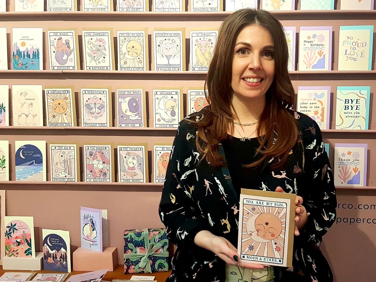
Pictured top: Emma Pearce, director of Sister Paper Co at Top Drawer. Her Sun with Moon tarot card signifies the journey of the soul. The sun represents positivity, a theme that runs through all of Gale’s spotted trio of trends.
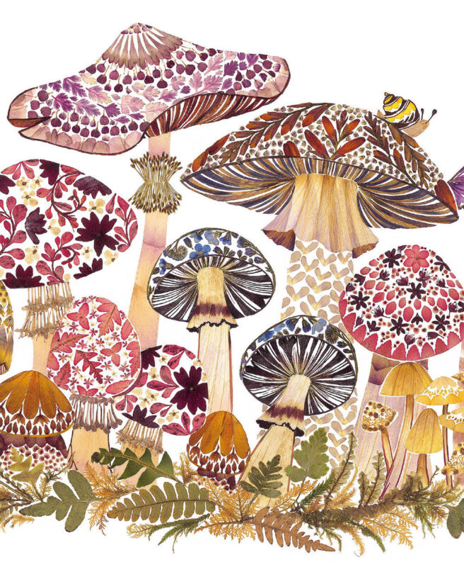
Pictured: Earthy coloured mushrooms created from petals from the Wild Press by Helen Ahpornsiri range by Museums & Galleries.
Trend 1: ‘Rewilding’ Earth Tones
In a flashback to the 70s, the rise of rattan, the macramé movement and delicate dried flowers, not to mention the wave of wicker, bamboo and cane furniture, have signalled the recent explosion in using natural materials in homewares and décor. And, sitting nicely among the cheese plants and bamboo shelving are the warm earthy tones and textures of organic shaped stone, terracotta and glass ornaments imbuing a restorative and calming vibe.
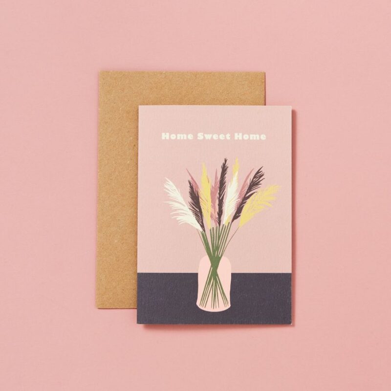
Biophilic design – light airy design using nature and natural elements – continues to grow as we appreciate the power of nature to uplift and revitalise our (home working) souls, whilst our minds have become increasingly sustainability aware. Pictured: Chocolate brown features in Type & Story’s dried pampas grass design.
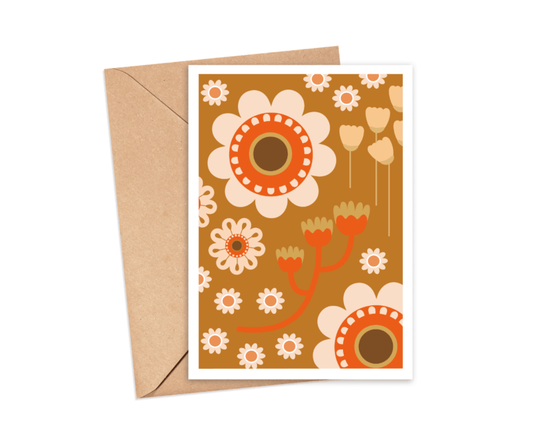
And, whilst flinging open both the doors and windows to this décor in our own homes, greeting card designers are inviting earthy tones and colours in a 70s styling into their new collections. Pictured: Caramels and orange in a 70s style print on a The Pattern Press card.
Shades of brown will be the dominant earthen shade for 2022. Deep chocolate, warming caramel, coffee and camel, complimented by teal or a funky orange, especially in bold flower power florals and patterns that are ‘far out’ on card designs this summer.
“Think dark wood, rich soil and terracotta, the trend for brown is huge for Spring/Summer 2022. Evocative of warmth and comfort, interior trends have embraced this luxury palette. We have seen our artists really love working with these earthy tones and we are excited to bring this into our collection this year,” reveals Helen Edwards, director of Eastend Prints.
In collaboration with Top Drawer, Natalie Alexander and Louise Healy-Adonis, directors of The Better Trends Company, curated the Launchpad area this year at the show, forecasting some key design trends for 2022. One trending terrain signalled the depth and soul of earth tones and their swell on card illustration and designs.
“‘Earthen Artistry’ is a trend that is translating into cards both through the evolutions of the earthy colour palettes and the organic style of illustrations. Warm chocolates, rust and forest greens contrast with teals and amber for a lush elemental spectrum that moves away from the simplified concept of ‘woods’ or ‘forest’ and instead embraces the breadth of life in flora and fauna.
Unstructured lines and uneven textures enhance the idea of natural imperfections through handmade craft,” highlights Natalie. Pictured: Rich chocolate, taupe and caramel earthy hues feature in card publisher, Eastend Prints’ artists work.
Slim Shady
Tom Cruise’s aviators, Audrey Hepburn’s cat eye lenses, Elton John’s pink palm shades, everyone looks cooler in sunglasses. From Ray-Bans to Oakley, stylish with a hint of attitude or fun and flirty, sunnies have been popular since the 1930s.
Pictured: A cool shade wearing cat (with caramel hues and orange florals) on a Sweetpea design from Stop The Clock Design.
And the future looks bright for sunglasses on greeting card designs, especially on female friendship and birthday cards. Through the vision of female empowerment, big and beautiful shades in summery colours adorn fashionistas on designs, their specs proudly declaring positive messages.
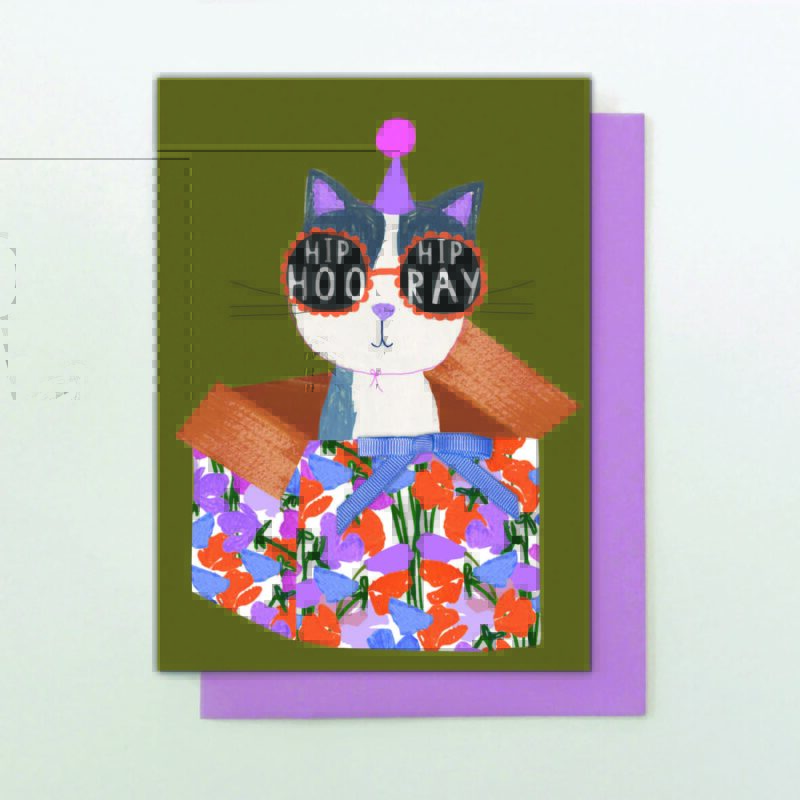
But it’s not just the lassies who are lens-luscious, with hundreds of pet fashion lines unleashed onto the high street in recent years, many pooches and felines are ‘cheaters’ accessorised on card designs too!
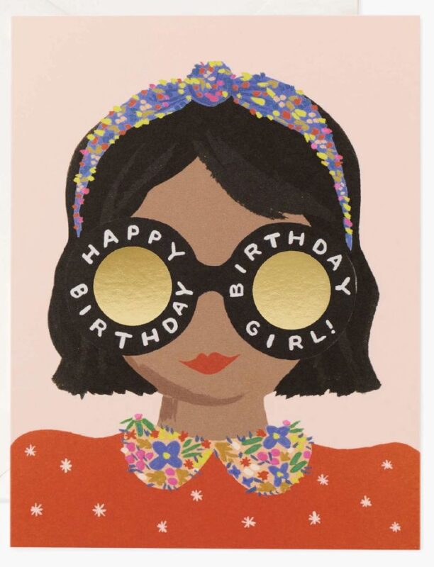
Pictured: A gorgeous birthday girl design from Rifle Paper Co. (partnered with 1973.uk).
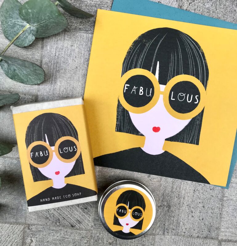
Cinnamon Aitch director Sara Burford confesses that the sunglasses design thing has become a bit of a passion at CA HQ, but it was a gradual process, evolving into the publisher’s latest range ‘She’.
“It all began with ‘Margo’, a range which heavily features dogs and cats. This evolved to an emphasis on dogs in the home, which led them to becoming more domesticated and humanised in the designs. Glasses and headphones started to creep in and glasses became a great vehicle for text and exploring quirky personalities. A natural progression was then to apply this to the female focused range ‘She’, which features bespectacled ladies with positive words stated on their eyewear.
The added beauty of sunglasses and glasses is that it adds a fun, stylish, graphic fashion statement but conceals the eyes, which could result in the card being too specific or personal for a wider consumer. Being a full-time wearer of glasses and loving the statement that can be made from such face furniture, it is a subject close to my heart!” Pictured: The ‘She’ range from Cinnamon Aitch features fashionistas wearing sunglasses with positive messages.
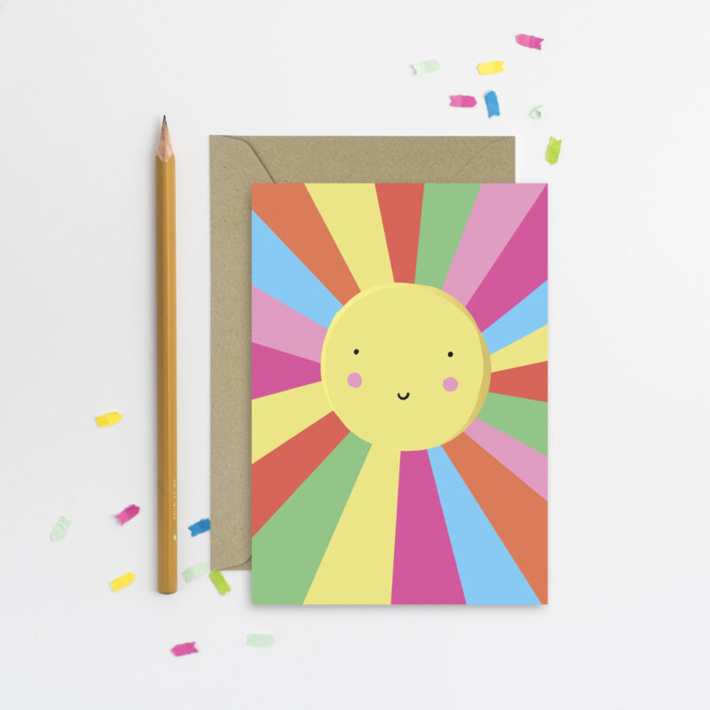
Happy Place
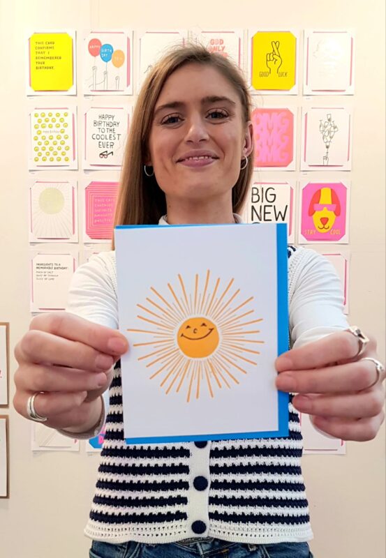
Dopamine dressing is predicted as one of the big fashion trends to watch for 2022. Joyful and bright, donning clothes in colours that make you happy and enhance your mood is a post pandemic upshot; the proverbial rainbow after the storm. Pictured: Georgia Bridges, sales director for 1973, bringing sunshine.
Never one to be left in the dark, greeting cards are strutting their dopamine design threads in a blaze of colour and playful 90s shapes on the card runway this spring, happily modelling optimistic, life-affirming and upbeat positivity and kindness slogans.
Natalie Alexander, co-director of The Better Trends Company, named this wave of affirmation as Positive Reinforcement in Top Drawer’s Launchpad trends area. “This playful, positive trend is inspired by the need for fun, release, hope and joy.
In a post-covid minimalist and digital first world this trend pushes back with analogue past times and 90s and early Y2K influences. Marbling, naïve florals and simplistic graphics pop with lime and clear brights, modernised with cobalt and orange accents.”
Pictured: Positive vibes on a Natalie Alex Designs card. Natalie is also co-director of The Better Trends Co (@thebettertrendsco/thebettertrendscompany.com)


Pictured: Lauren McCubbin, studio manager for Jade Fisher showcases one of the publishers supportive and uplifting designs and Awesome and Ace! Heidi and Dominic Early from Earlybird Designs display a few of their positive slogan cards.