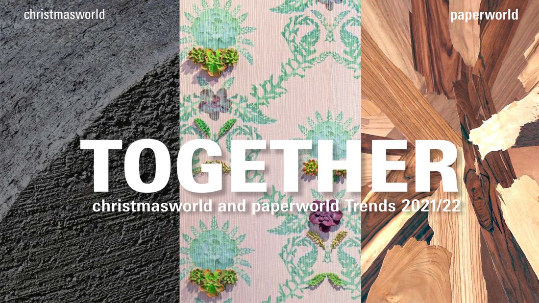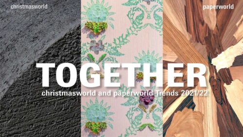
“Together” marks a new era of Christmasworld and Paperworld trends, whose product and style worlds are increasingly converging. The consequence is three joint trend statements with the upcoming themes, colours, materials, inspirations and styles. They provide the international decoration and office and stationery segment with orientation for individual product combinations.
Together is a powerful term at this moment in time and represents standing together in times of crisis. The pandemic has turned our world upside down. Physical distancing has caused people to come closer. Neighbours, friends and families are discovering each other in new ways and creating shared moments. Companies are restructuring. Working from home has become a necessity. As a consequence, more functionality is moving into the private sphere, but also more emotion into the working environment.
Modern living and working concepts are increasingly blurring the classic boundaries. Sustainability and general mindfulness are increasingly seen as the central themes. They can be found equally in the design of living spaces and home offices, from your favourite café to contemporary office environments, from intimate retreats to the shared festive moments of the year.
Hip stores all over the world are providing a mix of offers: new and second hand merchandise, fashion, flowers, decoration, stationery, a café, well-being, work – everything is presented in a unified way. But only through a curated selection does it mirror a new, more mindful lifestyle that appeals to customers.
The trends are encapsulated in three shared statements:
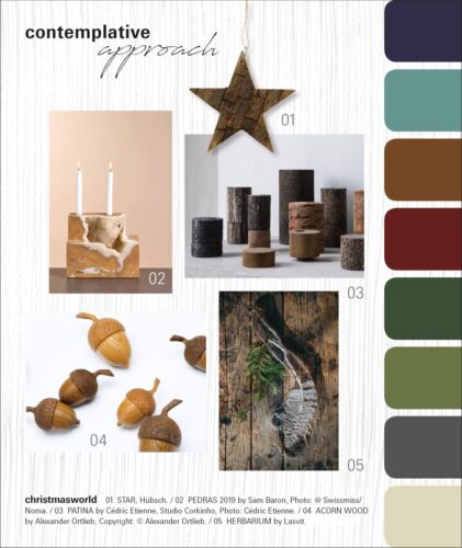
contemplative approach focuses on nature: original, tactile and unpretentious.
heirloom feelings reflects on poetry and gracefulness: nostalgic, young and playful.
spirited response inspires with sustainable solutions: original, creative and unconventional.
The three common style worlds show the themes, colours, materials, inspirations and styles for the coming season.
In “contemplative approach”, nature is a source of inspiration and material takes pride of place in the design. Renewable materials such as cork, bark, jute, grass and wood determine the unpretentious look together with metal, marble and stone. The materials remain in their natural state, are roughly hewn, broken, woven or rudimentarily processed. The tactile feel is important. So in addition to the rustic surfaces, finely polished, hand-caressing finishes emphasize the beauty of nature. Old craftsmanship is being revived. With seasonal decorations, clay and ceramics with a rough, sandy appearance look genuine and natural. The forest provides an abundance of designs and motifs, including acorns, bark, leaves, nuts, cones and fruits.
The colour palette emphasises the restrained mood and the tactile materials – these include dark juniper berry, light green, fawn brown, red beech, matt green, moss, basalt green and a warm, light stone shade. The individual tones appear deep, rich, almost of plant origin. The characteristic grains and patterns of the natural materials complement the harmonious picture.
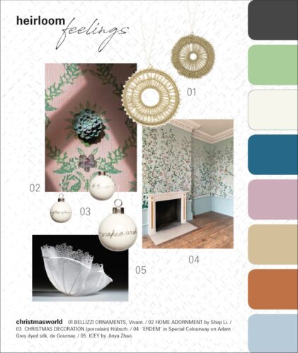
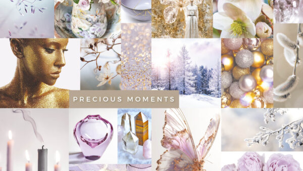
In “heirloom feelings”, new nostalgia determines the design. This poetic, young style opens up an optimistic perspective. Numerous artistic and playful aspects can be discovered in the design, including more down-to-earth interpretations in delicate hues. The cheerful, lively flora is striking. Blossoms, scattered flowers, mille fleur and vines sprout alongside frills, fine graphic designs, necktie and chequered patterns. The numerous romantic tapestries are in the foreground here as quotations from a golden era. The joy of adorning is reflected in every aspect of the product and of life: from festive decorations, gift wrapping papers and greeting cards to stylish working and writing.
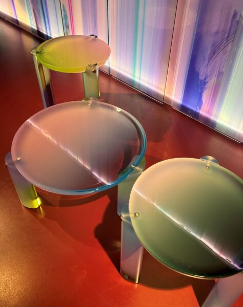
The colour range combines sensitive, optimistic tones. The palette extends from a velvety mouse-grey, delicate lime green, cloudy white and dark topaz to a romantic shade of rose, from light almond to a red tone and soft, airy sky blue. The materials reflect the refined composure: porcelain, glass, fine papers, handmade objects and surprising new interpretations of old craftsmanship. This is complemented by the delicate interplay of transparency, gold and brass lustre.
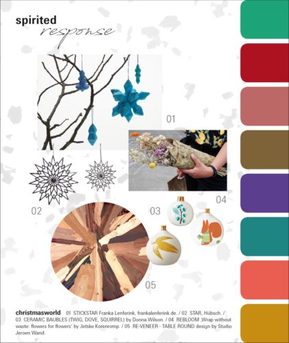
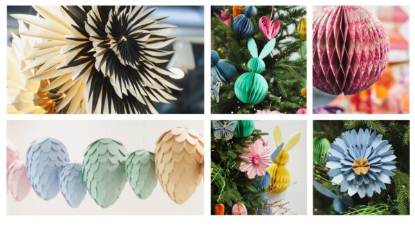
In “spirited response” the focus on sustainability as a necessity. This style world presents attractive alternatives and unconventional solutions that focus on zero waste, a circular economy and up & recycling. Here the emphasis shifts to the arrangement of the home office for job and school. The design is handcrafted, creative, cheerful, colourful and uncomplicated. Organic forms and eye-catching, illustrative designs reminiscent of the 1960s have a strong impact. Hand written or drawn print motifs, childlike sketches and ideas with an improvisational character round off the original style.
Spirited response shows a vibrant combination of everyday work and festive decorations. The colour palette combines vivid shades with random melanges that result from different recycling processes. Paper waste is transformed into papier-mâché, and old fabrics or cords become creative materials for new objects. Contrasting scrap wood combines to form striking eye-catchers, and flower waste is used to create unusual papers and gift packaging. The colours generate positive energy. Their range extends from intense sea green, fiery red, faded rose and a milky caramel brown to ultraviolet, Bristol Blue, bright flamingo orange and corn yellow.
The next Christmasworld takes place from 29 January – 1 February 2021. The next Paperworld takes place from 30 January – 2 February 2021.


