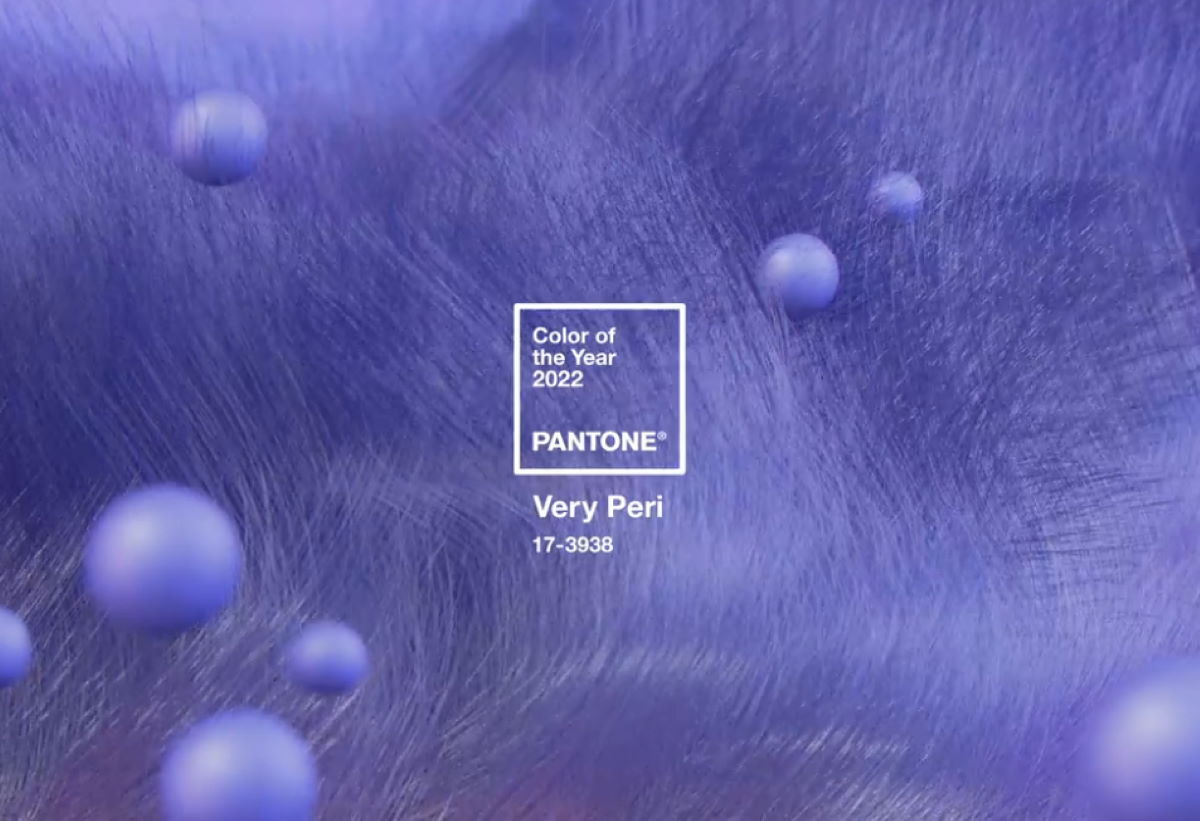
The Pantone Colour of the Year 2022 has been announced and, for the first time in the history of the selection, they have created an entirely new colour: Pantone 17-3938 Very Peri. This is what Pantone has to say about its latest Colour of the Year:
Displaying a carefree confidence and a daring curiosity that animates our creative spirit, inquisitive and intriguing PANTONE 17-3938 Very Peri helps us to embrace this altered landscape of possibilities, opening us up to a new vision as we rewrite our lives. Rekindling gratitude for some of the qualities that blue represents complemented by a new perspective that resonates today, PANTONE 17-3938 Very Peri places the future ahead in a new light.
We are living in transformative times. PANTONE 17-3938 Very Peri is a symbol of the global zeitgeist of the moment and the transition we are going through. As we emerge from an intense period of isolation, our notions and standards are changing, and our physical and digital lives have merged in new ways. Digital design helps us to stretch the limits of reality, opening the door to a dynamic virtual world where we can explore and create new color possibilities. With trends in gaming, the expanding popularity of the metaverse and rising artistic community in the digital space PANTONE 17-3938 Very Peri illustrates the fusion of modern life and how color trends in the digital world are being manifested in the physical world and vice versa.
The combination of violet red undertones and blues represents the transformation of the physical and digital world. This transformation has emerged following lockdowns and isolations which has meant the digital world has taken a new place in our lives. This shift is seen in many areas including in digital art, the NFT phenomenon (Google it!) and the rise of the metaverse. We are breaking new frontiers and with them come new possibilities and transformations.
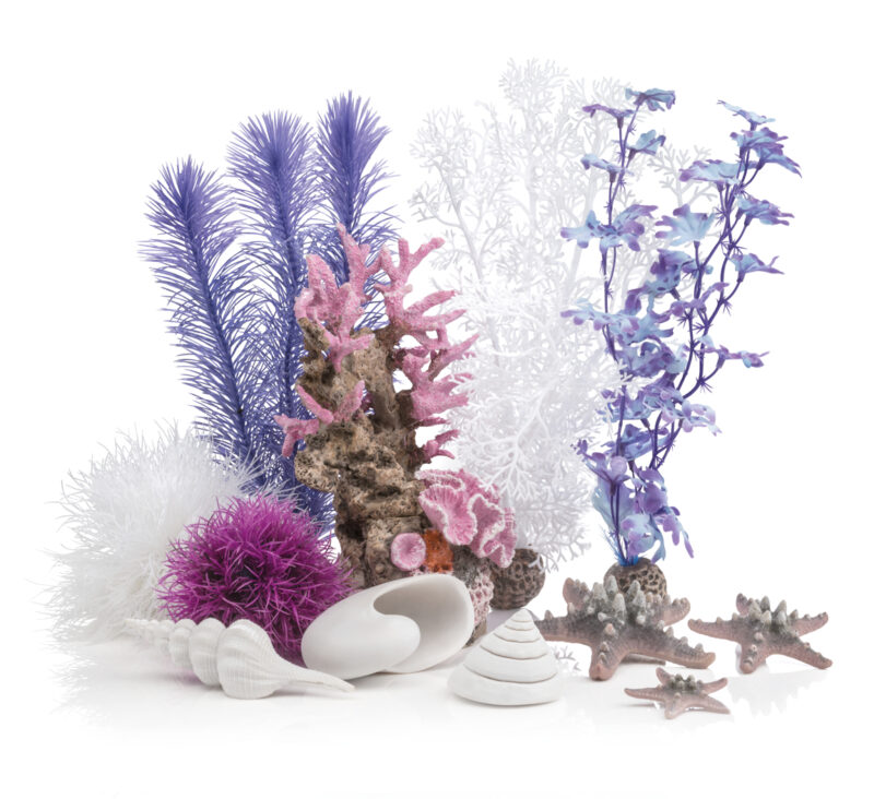
The particular hue of Veri Peri is perfectly captured by these beautiful and etheral bioOrb accessories by premium aquatics product specialist, OASE.
The executive director of the Pantone Colour Institute, Leatrice Eiseman, says: “As we move into a world of unprecedented change, the selection of Pantone 17-3938 Veri Peri brings a novel perspective and vision of the trusted and beloved blue colour family, encompassing the qualities of the blues, yet at the same time with its violet red undertone, Pantone 17-3938 Very Peri displays a spritely, joyous attitude and dynamic presence that encourges courageous creativity and imaginative expressions.
“The Pantone Color of the Year reflects what is taking place in our global culture, expressing what people are looking for that color can hope to answer.” added Laurie Pressman, Vice President of the Pantone Color Institute. “Creating a new color for the first time in the history of our PANTONE Color of the Year educational color program reflects the global innovation and transformation taking place. As society continues to recognize color as a critical form of communication, and a way to express and affect ideas and emotions and engage and connect, the complexity of this new red violet infused blue hue highlights the expansive possibilities that lay before us”.


