
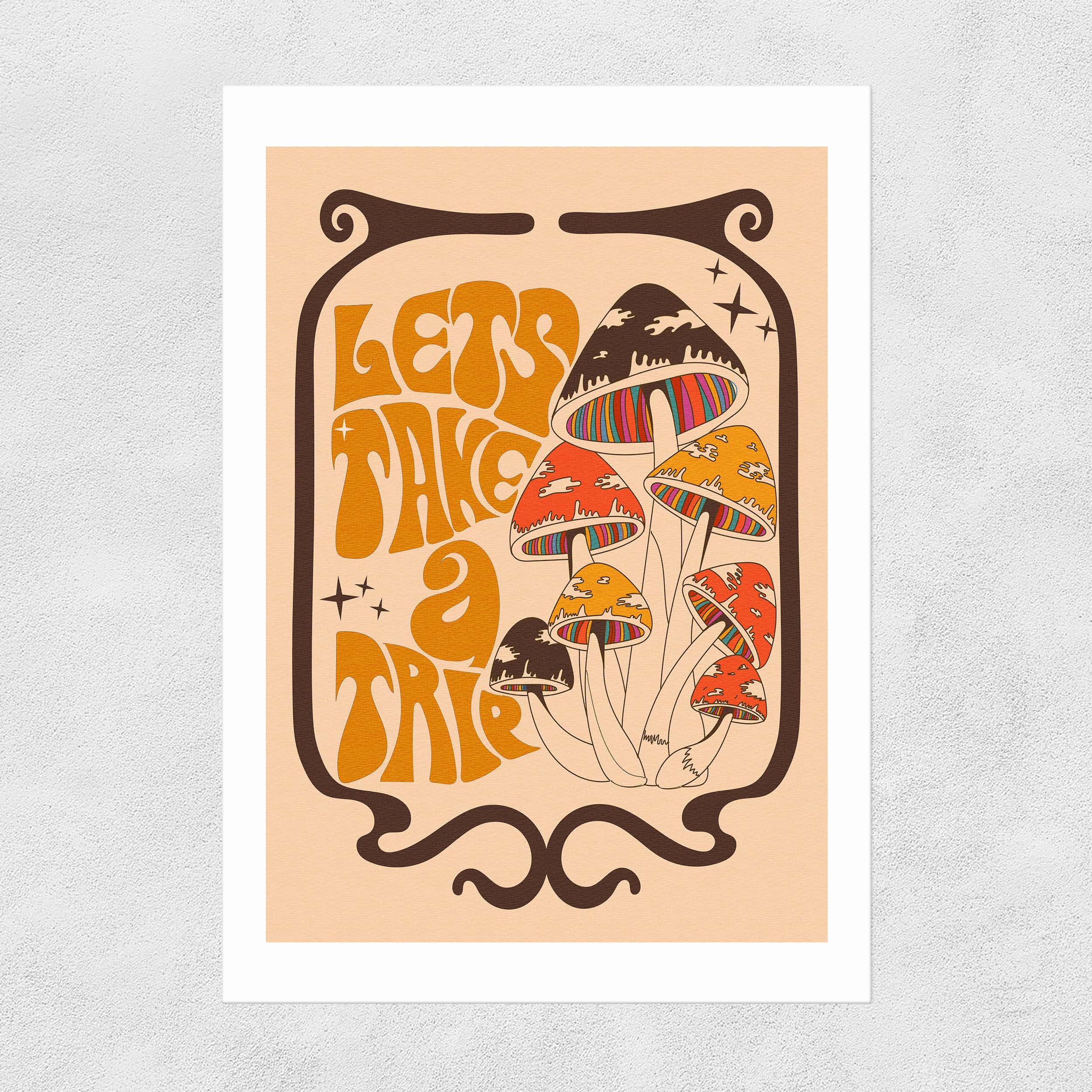
The hippy revival continues its positive spiritual odyssey across design, and, more specifically, greeting card design universe, but this season a hallucinogenic haze is drifting across its cosmic plane. Psychedelic bold candy-hued swirls, magic mushrooms and earthy organic shapes and shades, card designers are digging the 60s/70s love, peace and Mother Earth vibe and tuning in to trippy escapism as a backlash to global unrest and the financial crisis. After her own recent trips to the Autumn Fair and Top Drawer Autumn shows, journalist, promo filmmaker and photographer, Gale Astley, shares some of the far-out card trends publishers are riding across the design cosmos in this mind-bending revolution.
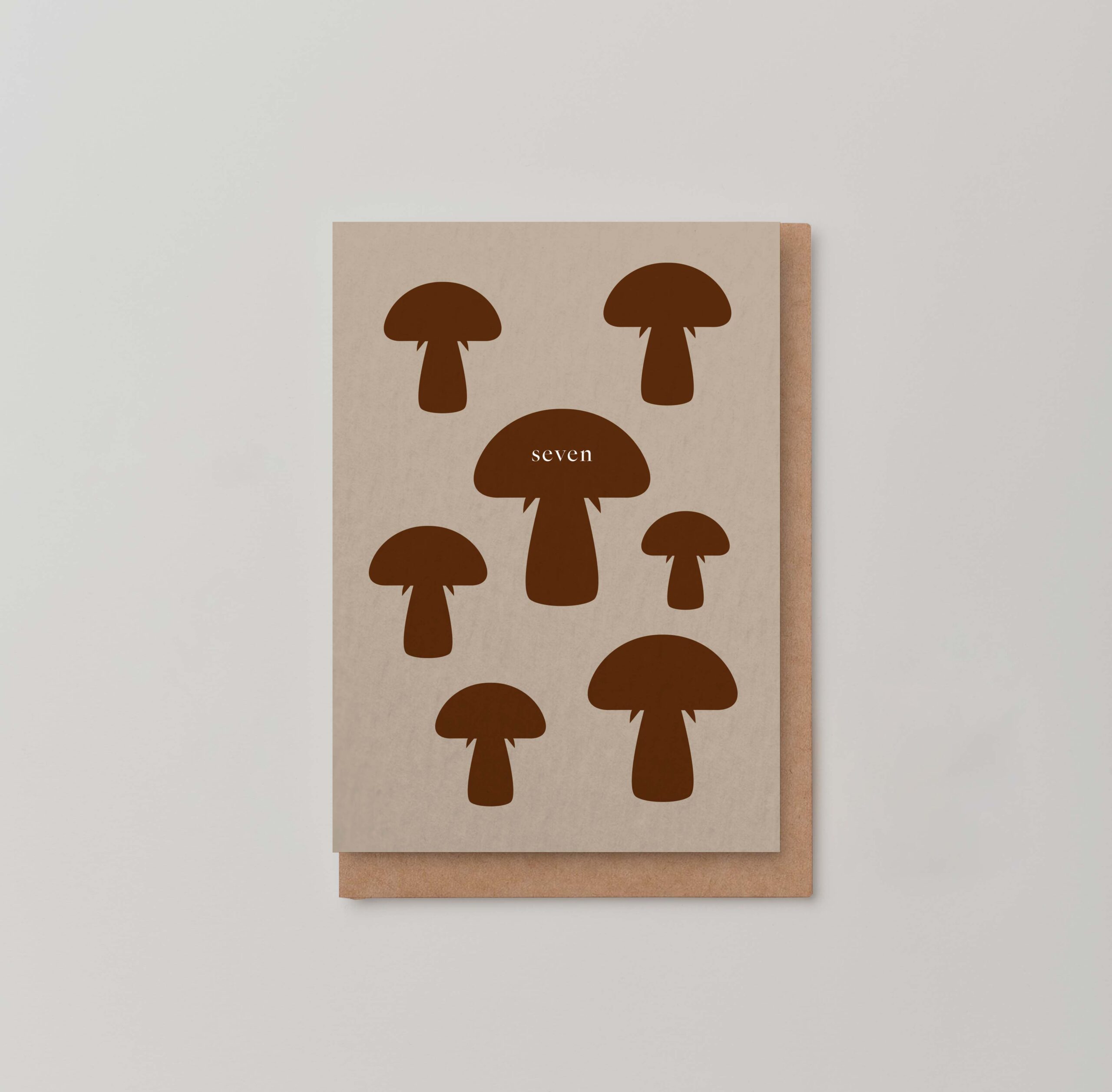
Shroom Boom
It’s a shroom boom, also known as magic mushrooms, on the fashion catwalks and in stores, with mushroom iconography on prints, homewares, gift and greeting card designs all spore-ing for room. Sarah Burtons’ AW22 fungus-fervent collection va va shroomed onto the runway for Alexandra McQueen and Urban Outfitters even has its own ‘Shroom Shop’. Currently selling on Ebay for thousands of pounds are Giancarlo Mattioli’s original Nesso toadstool-form lamps, and Harry Styles has added to his Pleasing cosmetics line a mini skincare and nail polish collection called Shroom Bloom.
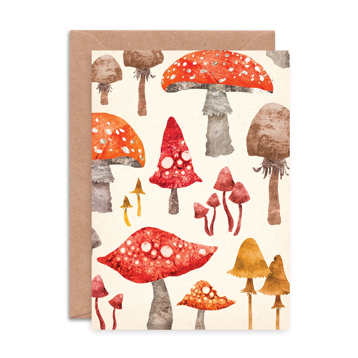
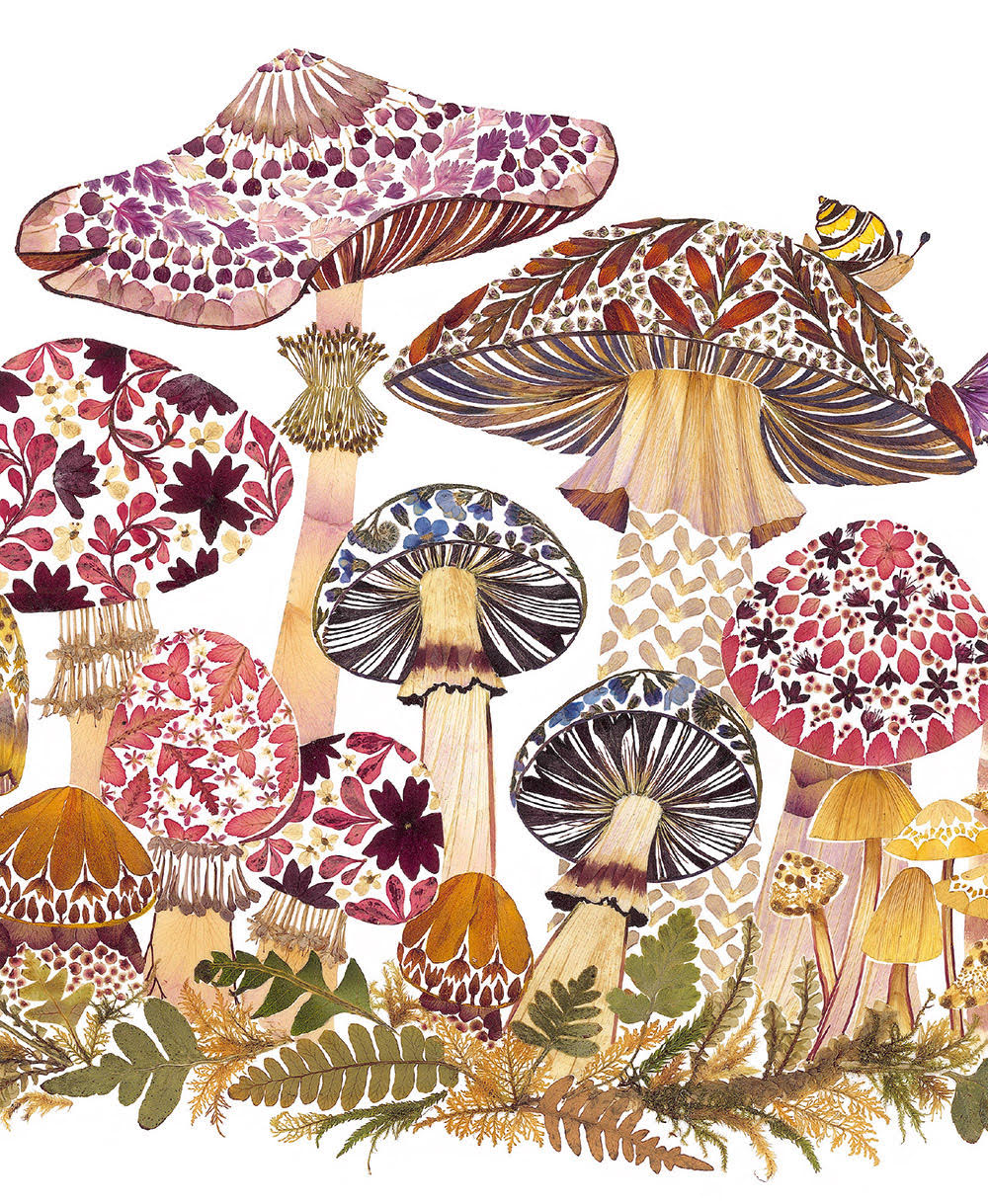
Pictured below: Beautiful toadstool patterns from Emily Nash Illustration, the magical world of shrooms on a Max Made Me design, the amazing diversity of mushrooms on an Icka design, Museums and Galleries’ gorgeous Helen Ahpornsiri’s artwork made from pressed plants, Illustrated by Golden Daze, a collection with 70S psychedelic vibes from Eastend Prints and Psychedelic love rays on a design from Petra Boase,
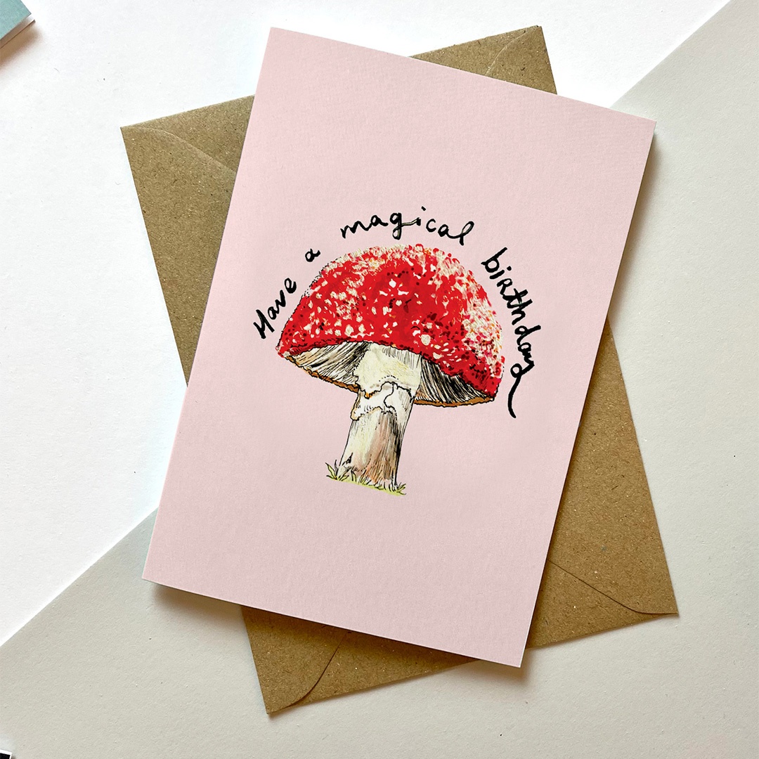
Also swooning with shrooms are greeting cards. From cute button, parasol and shiitake, oyster to morel, and of course the infamous red and white spotted hallucinogenic Fly Agaric, the range of organic shapes, beautiful filaments and earthy hues are ripe for picking on card designs, embodying a groovy 1970’s aura.
“Its mushroom season! Can’t beat a damp autumn to bring on a good crop. I think the whole psychedelic trend is huge for millennials and Gen Z right now – the trend of a 60’s/70’s revival is definitely up there for fashion and home decor brands, with Lucy and Yak and Urban Outfitters leading the way. Maybe it’s time to ‘turn on, tune in and drop out’ again!” jokes Helen Edwards, founder of publisher Eastend Prints.
“There is beauty in the mushroom kingdom that until recently has not had much research with them. Thousands of varieties to illustrate for artists – their structures are so fascinating and diverse and the fact that some are just so dangerous to consume. Did you know they even communicate with each other underground?” Helen adds.
In the current topsy-turvy world of war, politics and economic gloom, mushrooms are a fungus escape hero, signifying the trippy psychedelic wonder of an alternative consciousness and one of nature’s marvels – fungi’s earth-bound microcosmic realm: an eco-sphere of mycelium networks that allows mushrooms to communicate with each other… we’re talking about conferring toadstools, reminiscent don’t you think of the dreamlike fantasies of Alice in Wonderland.
Psychedelic Dreamscapes
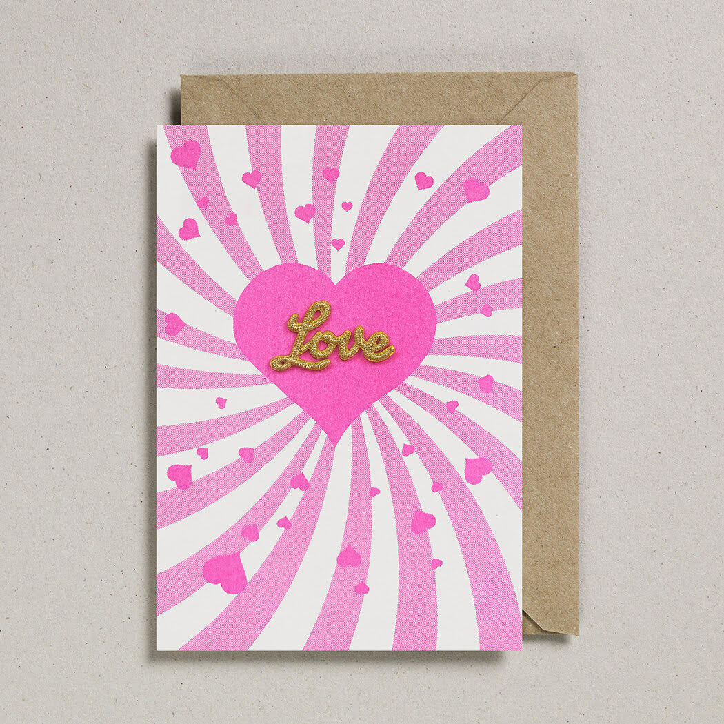
Whether you’re a peacenik or a radical revolutionary, the swirling, melting and playful aesthetics of the psychedelic 60s and 70s that are tripping on card designs this autumn are reflecting the chaos of the current confounding times but are also sharing uplifting messages of love, fun and good vibes.
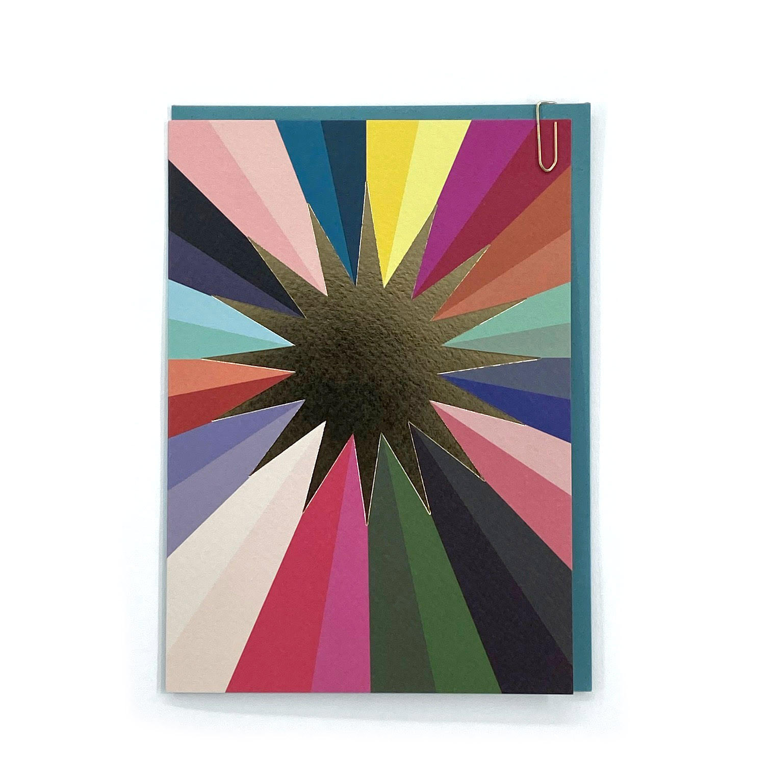
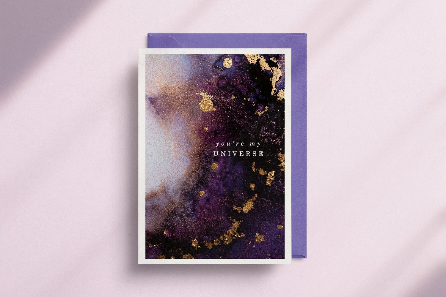
Cinematic odyssey, Moonage Daydream, a cosmic homage to David Bowie’s creative life and talent, including his early 70’s stage persona Ziggy Stardust, high street fashion’s abstract stream of retro optical geometric patterns, as well as a phantasmagoria of weird and wonderful trancy graphics and typography, are enhancing the hallucinogenic journey.
And lava lamp drips and acid trips in a kaleidoscope of mind-blowing colours are whirling on card designs, the psychedelic trend representing a carefree spirit and a yearning to break away from the ‘the man’, with a vision of a better world.
“I think we can all agree after the past couple of years we are craving a sense of escapism, a step back from reality and let our mind loose. The brands 1973.uk represent do exactly that. Designers such as Jordan Sondler, her litho-printed work uses fluorescent ink to really enhance the psychedelic feel, and Carolyn Suzuki, who uses bright, bold colours with gold foil features to powerfully communicate between different languages, colours, graphics and illustration which convey feelings and awareness that words sometimes just can’t do,” shares publisher 1973 UK’s sales director, Georgia Bridges.
Pictured above: Kaleidoscopic colours on a cosmic plane on Pavilion Prints’ Raydar (Festival) Wes design, Lava lamp curves and acid colours on a 1973 UK design by Jordan Sondler, On a celestial trip, ‘Universe’ from Wendy Bell Designs, Designer Sakina Saidi, founder of Heyim Sakina, tributes nature and nature’s hues on cards sharing positive thoughts, Well-known for neutral earthy colours, Kinshipped’s designs are calm and restorative, The fruits of friendship on this Autumn Stroll design by Kate and Peggy, Beautiful organic patterns in monochrome earthy hues from Ink & Bloom and Emily Nash Illustration’s design which celebrates diversity and unity.
Mother Earth
One trending terrain signals the depth and soul of warm earth tones and organic shapes, and their swell on card designs is bedded in the calm, soothing and restorative powers of nature and well-being. Like a wonderful, mentally refreshing autumnal woodland walk, the designs attribute natural, simple and pared down forms, embracing the marvel of flora and fauna in deep chocolate, warming caramel, rich coffee and camel hues paired with terracotta, nude and peach.
The fruits of friendships and diversity are also celebrated within this earthen tinted Eden on card illustrations. It’s a haven on Mother Earth where not only are all its inhabitants unite in harmony but are cherished and nurtured too.
Kayleigh McCardle, founder of card publisher Kinshipped, believes, “In a world of chaos the consumer is definitely seeking ‘calm’ and the need for such has evoked the ‘mindful’ movement. We believe this is now translating through every area of life now, from workplace ethos to parenting and even the way we decorate our homes. Key to creating this calm is the colour we choose to surround ourselves with, which is why we are now seeing neutrals and shades of ‘murk’ available with our favourite decor brands such as The Paint and Paper Library. Our brand and its ethos around mindful creation and sustainability lends itself beautifully to sticking within the muted neutral palette.”
So, whatever your spiritual design trip, tune in to the good vibrations card designs are sharing!
Pictured below: Designer Sakina Saidi, founder of Heyim Sakina, tributes nature and nature’s hues on cards sharing positive thoughts; Harmony, diversity and love reigns on an Elsa Rose Frere card.


